
WHETHER you’re a beginner exploring data visualisation options or an expert, there’s plenty of free tools available to help you craft a narrative backed with compelling data.
Here’s our pick of top tools for creating charts, interactive maps and tables. Most are international brands, however they have all been tested and identified as suitable for Australian use.
1. Infogram
Designed to be intuitive and user-friendly, Infogram is packed with a lot of templates, features and customisation options to create infographics and reports with data, text and other graphical elements.
- Difficulty: Easy
- Price: Free for basic version
Pros
- Simple to use
- Variety of data visualisation options
- Can add data from Dropbox, Google Drive and JSON feeds. Live data feeds are possible on the paid versions.
Cons
- Complexity grows when uploading bigger datasets
- Free version has limitations, such as restricting the number of projects and project pages each user can create
- Interactive maps are quite limited, making it difficult to visualise location-based data
2. Flourish Studio
Generally user-friendly online application with a focus on interactive data visualisations. Flourish may require more exploration and explanation for beginners, but offers powerful features.
- Difficulty: Easy-Moderate
- Price: Free for basic version
Pros
- Huge library of data visualisations
- Extensive customisation options
- Powerful free tier allows users to create an unlimited number of projects
- Can embed interactive charts into Canva
Cons
- May take some patience and experimentation for new users to get used to the platform, including getting the data into the right format
- Advanced features or charts such as point maps can have a steep learning curve
- Limited options for interactive area or shading maps without knowledge of boundary files such as SHP, GeoJSON etc.
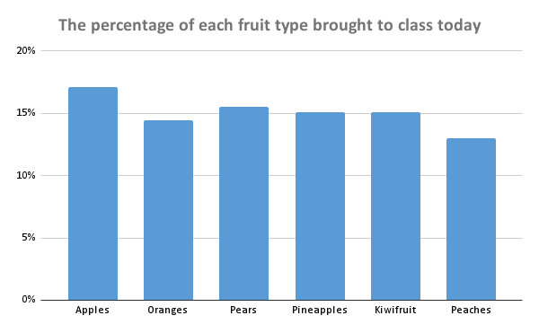
3. Google Sheets
Similar in many ways to Microsoft Excel, Google Sheets allows you to perform basic analysis on a lot of data and create basic charts without much technical knowledge.
- Difficulty: Easy
- Price: Free
Pros
- Easy to create charts such as bar graphs or column charts, line charts and pie charts
- Real-time collaboration
- Powerful data analysis features, entirely for free
- As a Google product, it’s very easy to open files straight from Google Drive or merge spreadsheets together
Cons
- Some charts are more difficult to create, such as Candlestick charts and treemaps
- Limited sharing of interactive data visualisations. There is a Publish to the web feature, however this allows you to share a Google Sheets tab rather than a single chart
- More advanced features and functions come with a steeper learning curve
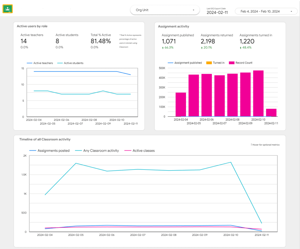
4. Google Looker Studio (formerly Data Studio)
Google Looker Studio is a feature-rich tool for creating interactive and customizable dashboards using data from various sources.
- Difficulty: Moderate
- Price: Free for basic version
Pros:
- The free version is very powerful
- Easy integration with other Google Services such as Google Sheets and Google BigQuery
- Real-time collaboration
- Variety of data visualisation types with a high level of styling and appearance customisation
- Availability of interactive maps including heat maps and point maps
Cons:
- There can be a learning curve for beginners, particularly with the wide range of visualisation and customisation options
- Limited control over data refresh in the free version
- Can be slow to process large amounts of data
- Interactive maps are fairly limited in terms of customisation options and support for different location types
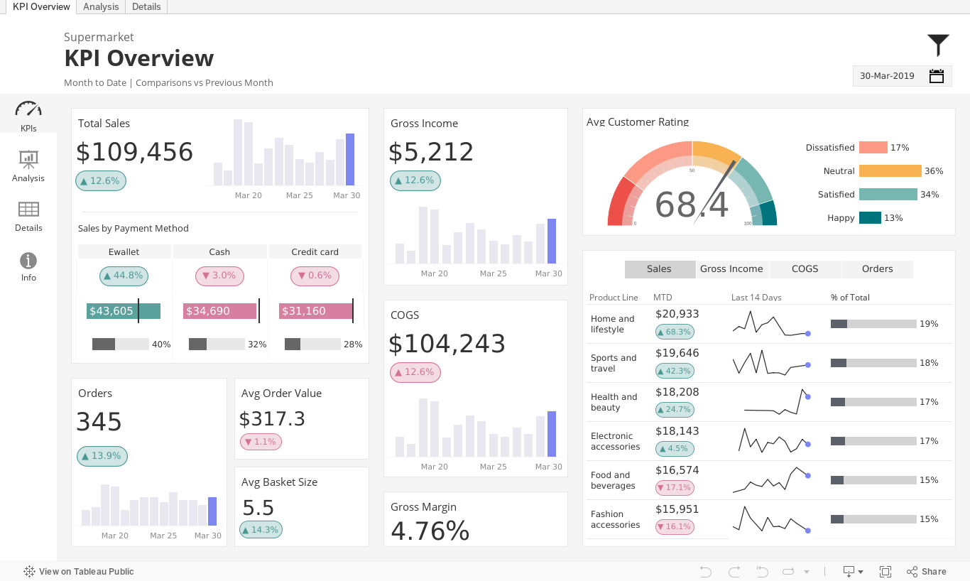
5. Tableau Public
Tableau Public is a free version of popular analytics platform Tableau. It’s a powerful tool with a lot of capabilities, however there is a steep learning curve so it’s probably not suitable for beginners in the data visualisation space.
- Difficulty: Complex
- Price: Free
Pros:
- Powerful data visualisations with a wide range of chart types
- Creating interactive dashboards
- Strong online community
- Users can connect various data sources such as Dropbox, Google Analytics, Google Drive and many more
Cons:
- Visualisations are publicly accessible on the web – users can’t make private projects
- Steep learning curve, especially for beginners
6. Canva Graphs
Canva Graphs is a more recent feature of the popular online graphic design app Canva, allowing for easy chart creation for documents, reports, slides and more.
- Difficulty: Easy
- Price: Free for basic version
Pros
- Using prompts to get you started, Canva Graphs are simple to create and modify
- If you use Canva for other projects, graphs are very easy to integrate across creations
Cons
- Can be difficult finding the most suitable free visualisations from the template library
- Better suited to small amounts of data
- Less suitable for comparing large amounts of location-based data
7. Vizall
If you’re using location-based data or would like to compare data, our online app Vizall has a powerful free tier for beginners to create interactive maps and searchable tables.
Vizall uses automation techniques to remove the complexity often associated with creating maps. It matches your data against suburbs, council areas, postcodes and many other location types and puts them on a map automatically.
Maps are tailored to Australia, with a lot of compatible location types across the country.
- Difficulty: Easy
- Price: Free for basic version
Summary
We hope this list has helped you narrow down the best visualisation option for your project. If you wish to use common chart types such as bar and line charts there’s plenty of options out there. Tools such as Flourish, Canva or Infogram are best for simple data while analytics platforms such as Google Looker Studio and Tableau can be better suited to bigger datasets.
It can be more difficult to find easy tools to create less common but equally powerful visualisations. Beginners may wish to look for instructions or videos online to help them make treemaps, box and whisker plots and other graphs using Google Sheets, Google Looker Studio or Flourish.
Maps can be trickier to create, however Vizall is good option for beginners to visualise many different location types on sharable interactive maps.