
Working with data can be overwhelming when you have a lot of rows and columns. You know there’s something interesting to be uncovered, but how do you find it?
Vizall can help you make sense of the numbers. It spots errors and fixes them, shows you interesting stats such as most frequent words used and the largest and smallest values, then puts it all into an easy-to-read visualisation.
If you need some guidance to get started on your first project, we created this step-by-step guide for you.
Caption: Interactive maps can be easily created for location-based data across Australia. All you need is one column with suburbs, council areas, states or more.
JUMP TO:
If you have a spreadsheet ready to go, sign in and we’ll get started.
If you don’t have a xlsx or csv file, here’s a few publicly available datasets you could try:
- NSW Crime Data by Suburb (2018-2022)
- VIC Schools and Enrolment data (2022)
- Direct download: XLSX file
- AUS Labour Market Regions (2023)
- Direct download: XLSX file
There’s also one dataset called Building Approvals Victoria 2019-2020 available to you on your Vizall dashboard.
If seeing the outcome first helps you plan data projects, take a look at some examples of use cases, maps and tables here.
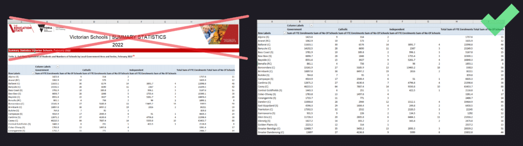
If you’re choosing to upload your own, open it up in a spreadsheet program such as Microsoft Excel or Google Sheets to make sure the data looks normal. It helps to delete any large headers or logos so its easier for Vizall to find relevant columns.
Upload Data
After sign in, click Upload Data on the dashboard or drag and drop your file in. It will automatically open once its loaded*. If your spreadsheet was already uploaded, open it up.
*If you used a xlsx file with several spreadsheet tabs you’ll need to head back to the Vizall dashboard and find the tab you need. Vizall uploads all of them as separate files named, for example, File 1, File 2, File 3 etc.
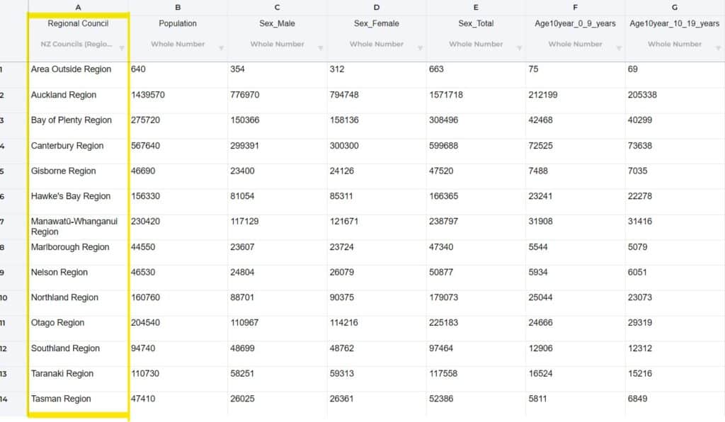
Each column of data will have a title that Vizall inherited from the uploaded data, and a grey subtitle, which tells us the type of data it has found in the column (for example text, numbers, dates or addresses).
If Vizall didn’t label your columns correctly
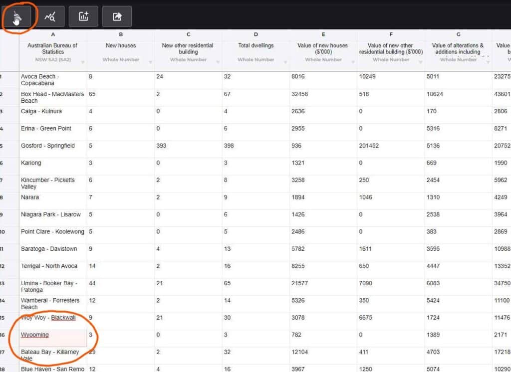
Sometimes Vizall doesn’t quite get this automation right. For example you might expect it to have identified NSW suburbs, but instead it says NSW SA2, for example. This might happen if there’s a few unusual place names in your data, or some data has snuck in from another location.
Take a look at the data and see if there’s any obvious mismatching values and, if possible, right click to delete the row. Click the small light grey arrow next to the subtitle and run column estimation again.
If it still hasn’t worked, you can manually correct the column types using the grey arrow again and picking from the dropdowns.
Using the Data Cleaner
Click on the data cleaner icon and select the column you’d like to check for errors (such as numbers or dates that aren’t all formatted consistently, spelling mistakes or inconsistent commas in addresses, suburbs and states).
If you went through the steps in Upload Data above to ensure the column estimator worked, you’re ready to click next and wait for the ‘Analysing’ screen to complete.
Once it loads, you’ll get a summary of the problems found in the data. Click Start Cleaning.
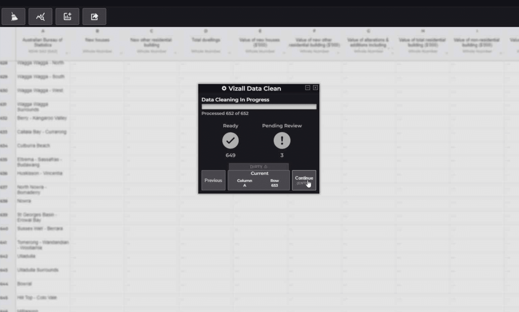
The data cleaner will now fix as many errors or inconsistencies in that column as it can, then ask you to review anything ambiguous. It will highlight the cells it couldn’t match and present you with a dropdown of potential replacements.*
Once you have reviewed a cell, press Enter or Next to move onto the next error.
*If the Data Cleaning in Progress pop-up shows a large number of data points that are “PENDING REVIEW”, it means Vizall wasn’t able to understand a lot of the data. You might need to look at the original data source or the column estimation again to see if there’s an obvious reason.
Get Insights
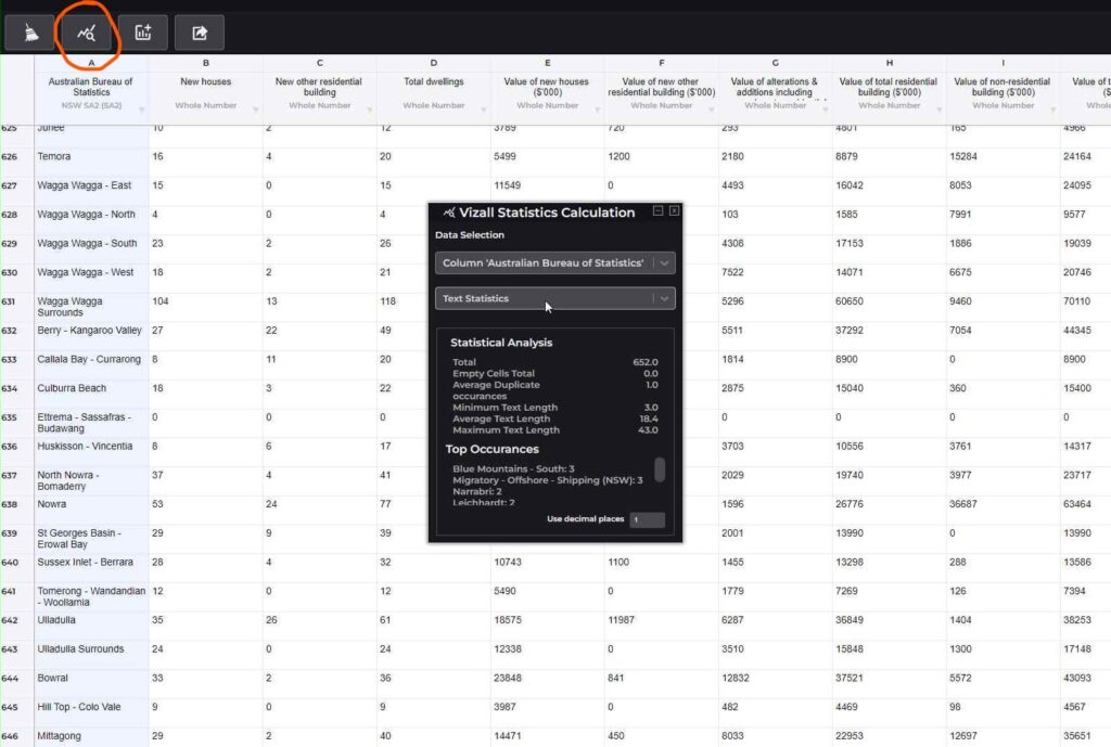
Once the data cleaning completes, click on View Statistics from the menu to get some interesting summaries about what’s in your data.
This includes information such as the maximum, minimum and average values in a column. Or if its text, the most frequently occurring words, average text length and maximum text length and the average number of duplicate values.
Once you’re done, click Create Graphic from the menu to move onto the next step. Pro users can also export clean data to look at further in spreadsheet or data analysis software.
Create a Map
Before we get started, your data needs to include:
- At least one column with locations (e.g. suburbs, council areas)
- Only one row for each location*
- One or more additional columns containing the values to map
*The reason there can only be one row for each region is that Vizall cannot currently handle duplicates, so it will pick just one to display and the values for the other will be ignored. If you need a hand with creating a PivotTable to group duplicates, reach out to us on the community.
With your spreadsheet open in Vizall, select Create Graphic from the menu and choose Create Area Map.
You’ll hopefully see data already loaded onto a map like in the example below.
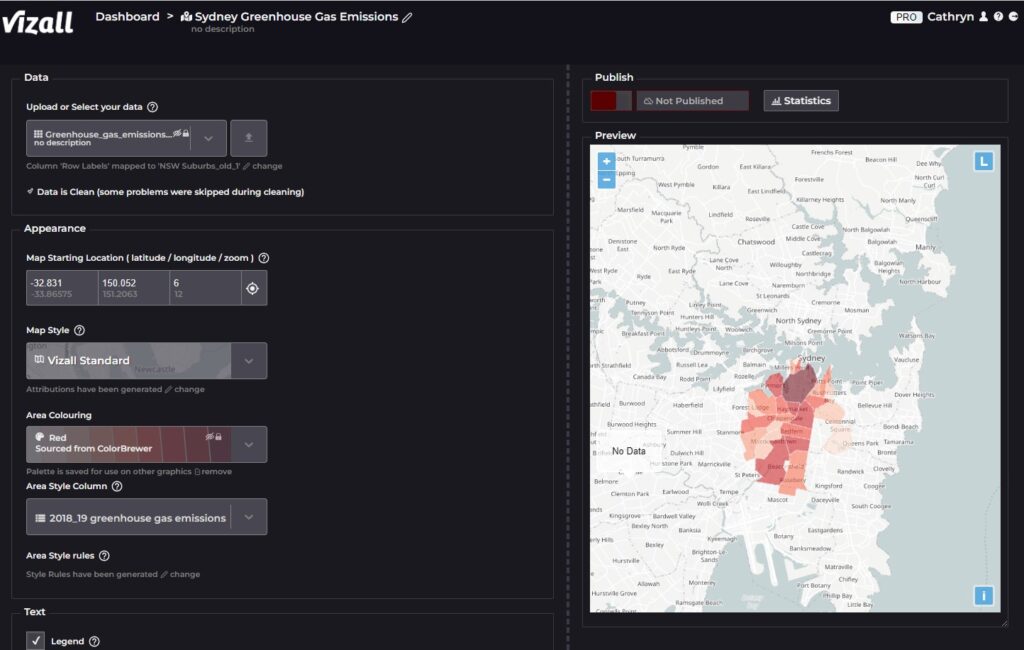
Vizall works some magic to match up locations with geographic areas, but sometimes it gets that wrong.
If you’re not seeing data on your map, click change in the top Data section. This is where you can tell Vizall which one of your spreadsheet’s column contains a location, like suburbs, to line up with a matching map boundary. For example, if you have QLD suburbs in a column called Suburbs, select this from the Select Location Column dropdown, then under Select map boundaries find “QLD Suburbs” from Vizall’s list of recognised locations.
Here’s a guide to the types of customisations you can make to your map:
Appearance section
- Map Starting Location: Alter what someone sees when they first opens your map. Either choose exact coordinates or press the centre button to save the starting location as the map’s current position;
- Area Colouring: Pick the colour scheme for the data on your map;
- Area Style Column: Choose which column in your dataset should be visualised on the map;
- Area Style Rules: Customise the rules that justify what colours are used and when.
Text section
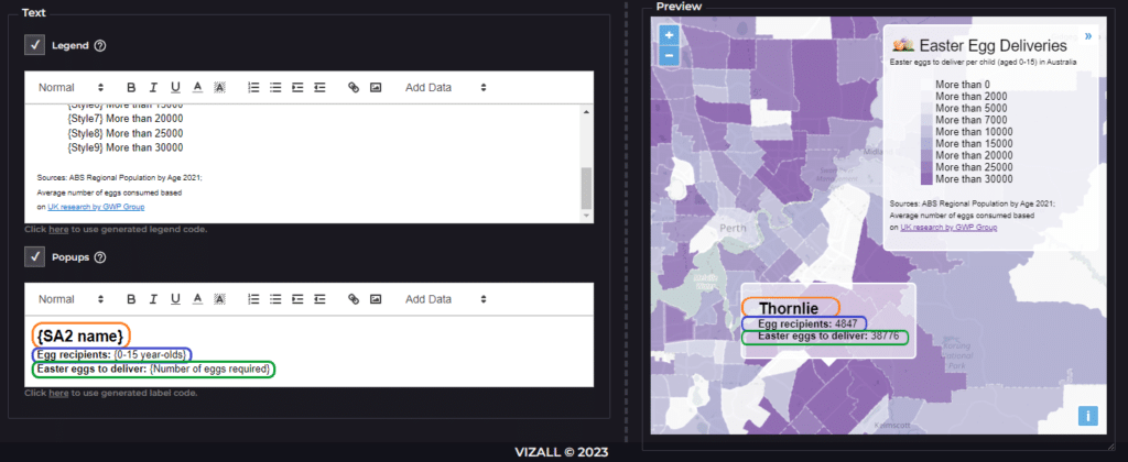
- Legend: Alter the text that appears in the legend in the map’s top right corner. This can include headings, information about sources, images and information about the map style colours.
- Popups: This is the information seen when a person hovers over an area of the map. Create dynamic content based on your spreadsheet’s data using the Add Data button. This is represented with { } brackets. You can also add other elements such as headings and images.
Once you’re happy with how the map looks, we strongly recommend going through and spot checking to make sure the data and labels are accurate. Check against the original data, and be sure your original data source is reliable and accurate.
It’s time to hit publish! In the Publish section, click the red button. You can get a link to share your map online using the Share URL button, or use the Share Code to embed interactive maps on websites or blogs.
Searchable Table
With your spreadsheet open in Vizall, select Create Graphic from the menu and choose Create Searchable Table.
Enter a title for your table, and customise column names in the Columns section, or untick columns you wish to hide from viewers.
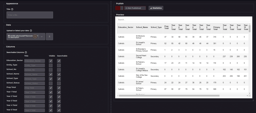
Once you’re happy, spot check the data to make sure the numbers line up. Check against the original data, and be sure your original data source is reliable and accurate.
Press the red button in the Publish section to go live. You can get a link to share your map online using the Share URL button, or use the Share Code to embed interactive maps on websites or blogs.
Final Words
We’re working on more ways to prep your data in Vizall so there’s less you need to do. In the meantime, if you aren’t sure about any of the steps above please reach out to us at the community where we’d love to help you.
If you’d prefer to email us directly, please do! We would love to hear from you about concerns, questions or feedback.
Happy Vizalling!