How to visualise building approvals

Understanding how much construction has been approved across a city tells a story of its economic growth.

The Australian Bureau of Statistics (ABS) releases monthly Building Approvals data so individuals, businesses, economists and more can access these insights for free each month.

Its usually released at the end of the month for the month prior, with data by region available about one week later. April’s regional data appeared on June 6.

With a bit of cleaning you can easily visualise building approvals on an interactive map using Vizall. As a bonus, you can also apply many of the same steps below across other ABS regional datasets.

Building approvals data is released monthly for small areas similar to suburbs called ‘Statistical Area 2’ or SA2. This ACT map shows April total residential building approvals by SA2. 

Jump ahead


1. Download the data

While the ABS doesn’t break building approvals data down by suburb, it does use a similar area type called Statistical Area Level 2 (SA2).

Go to the ABS latest building approvals page and buried in the Data download section look for the subheading Small area datacubes. Download the SA2 Excel file (XLSX) for the state you’re interested in and choose your time period. For this tutorial we’re using Australian Capital Territory (ACT) 2022-2023 FYTD data. Here’s a direct download of that spreadsheet.

If you’re state isn’t displayed, select the Show all data (7 hidden) button to see the full list of areas.

You can also download data for your state broken down by LGA (council areas). Those are larger areas but the data is much simpler. If you take this approach, you can skip section 3 and 6.

Look for the state or territory file you want to download and select the desired time period. Then click Download XLSX.
Caption: Look for the state or territory file you want to download and select the desired time period. Then click Download XLSX.

2. Upload to Vizall

Sign into VizallGo to your computer’s XLSX download location and drag the file straight into the Vizall dashboard. Alternatively you can click Upload Data and navigate to the file that way.

Building Approvals datasets have two tabs. The first one that opens after the upload gives general information about the data. Go ahead and delete that one when you’re ready. To do that, click on the pencil icon next to the filename at the top of the page, and click delete document.

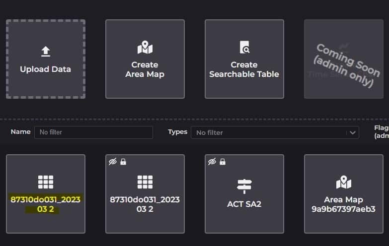
Now you’re back at the dashboard, click on the other spreadsheet created for you when you uploaded the data. It will likely look something like this and appear at the top of your saved documents.

The ACT building approvals data should be at the top of your dashboard. If you haven't changed the filename yet, it will have a long name with a mixture of letters and numbers.
Caption: Open the building approvals dataset from the top of your documents list. It will look similar to the one highlighted above if you didn’t change the filename.

3. Clean the building approvals data

This dataset needs a bit of touching up before it’s ready to visualise. You’ll likely see something like this:

After uploading your ABS data to Vizall it will look something like this, with empty column headers and blank cells.
Caption: What your ABS building approvals data looks like after its upload to Vizall.

The way ABS regional data is structured can be a bit of a pain to work with. This is because one column includes the data for all location levels – for example SA2 (comparable to suburb) and SA3 (larger areas, like council areas).

Take a look at Column B above and you can see row 10 is the SA3 area Belconnen, with a 5-digit ID associated with it in column A. 

But look two rows down. Belconnen appears again with a different code; a longer code made up of nine digits. That’s the smaller SA2 area within the greater Belconnen area. If you’re confused, you’re not the only one. Location boundaries are confusing.

This makes it tricky to work with, but we’ll fix that up in no time. First, let’s tidy up the headers.

4. Fix the headers

  • Right click on the row labels 1, 2 and 3 and select Delete Row for each
  • Highlight the column header titled Column B and type in a new name such as SA2
  •  Write or copy and paste the column names sitting in row 1 into the header spots, replacing the labels ‘Column C’, ‘Column D’ etc
  • Lastly for each of the columns with ($’000) in row 2, cut and paste them into your column headers like this:

Otherwise when viewers look at the data on the map they will assume, for example, an area had $335,871 worth of new homes approved, when really it should be interpreted as $335.9 million.

  • Delete redundant rows 1 to 6 by right clicking on the grey index for each row and selecting Delete Row. 

5. Run the automated data cleaner

Press the broom icon to start the data cleaner. Highlight the SA2 columnClick Next.

The summary should tell you there’s 146 rows to clean (if using the ACT data), and eight problems. There shouldn’t be more than 5-7 per cent problems in these datasets, otherwise there might be something else going on. Press Start Cleaning.

The errors Vizall will get stuck on are the unwanted SA3 areas because it will be trying to interpret them as SA2s. If using LGA data, you shouldn’t run into any issues in this step. 

Hit Enter or press Next to skip through them without making any changes. They will be ignored on the map. 

You can go back and delete these rows if you want – they will have a faint orange border.

6. Check for duplicates

We’re almost there! Due to the handful of SA3 areas mixed in with the same name as the SA2s (such as with the Belconnen example earlier), Vizall will get confused and just pick one of the two values to visualise. We’re working on a better fix for this, but in the meantime this is how to get rid of those rogue SA3 rows:

  • Select the View Statistics icon and highlight the SA2 column again. Take a look at the Top Occurrences section and you will see some duplicates. You can ignore the Migratory Offshore rows because they won’t appear on the map.
  • Fix these duplicates one at a time by locating the SA3 version the area and deleting the row. Remember the unwanted SA3s have a shorter location code in Column A, such as 80110. To make this a bit easier, hit CTRL + F and search for each of the duplicate areas and move onto the next one.

7. Visualise using an interactive map

Your building approvals data is ready to visualise! Press the Create Graphic icon and then Create Area Map.

You should already be seeing a basic map with a red colour scheme. Right now it’s most likely showing you the number of new houses approved (the darker the red, the more homes approved to build). You can tweak the appearance or the thresholds for each colour bucket in the Appearance section.

Try picking a new column to visualise in the Area style column dropdown. Perhaps you’d like to visualise the value of new residential building, or the value of non-residential building.

In Area colouring you can pick a different colour scheme. In the Map starting location section you can choose what point you’d like the map to start on when someone first opens it up. First zoom and move around the map until you have it in the desired spot, then press to centre the map on this new location every time a viewer opens it up.

Lastly, you can customise what’s in the Legend (top righthand corner of the map) or the Popups (when you hover over areas on the map) in the Text section.

8. Share your creation

When you’re ready to publish hit the dark red slider to make the map go live. You’ll now have a Share URL to give to friends, colleagues or to publish on social media. The Share Code can be embedded on a website or within an article.


The ABS also publishes building approvals data by LGA. The map shows all housing and unit approvals by LGA across Australia. Zooming into each area gives more insight into what’s happening locally.