POINT maps are a fantastic way to visualise data, such as house listings, schools and other points of interest on a map. They can be published to a wider audience online, or tailored for specific clients.
Recently we launched point maps as a new feature in Vizall. To make one, simply create a free account, upload a spreadsheet containing addresses, and watch as Vizall transforms those addresses into a helpful interactive map – with very little effort on your part.
If you get stuck along the way, we have created this how-to guide to help you along from start to finish. We used Adelaide, South Australia real estate data but you can adapt this easily to many other areas of interest.
Step One – Choose your Data Source
You’ll need a CSV or XLSX spreadsheet file to upload. There needs to be one column containing a point position, for example a column with street addresses, and at least one additional column containing the value you want to visualise.
This could be numerical, such as a house price or number of bedrooms, however you can also create the map points using text (or categories).
For example you could create green tree points if the value is “parks” and a brown building for “schools” and a red house for “houses”.
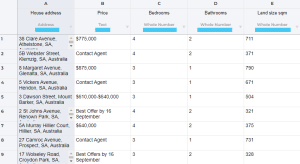
Here’s an example of for-sale street properties using a snapshot of data from realestate.com.au.

Step Two – Upload
Visit the Vizall sign in page to log in or sign up. Drag and drop your spreadsheet onto the Vizall dashboard or press Upload Data to navigate to the file location on your computer.
The dataset will open, and Vizall will automatically determine the column types in your spreadsheet. See below for an example (the automatically selected column types are highlighted blue).

Step Three – Cleaning your Data
Your uploaded spreadsheet might show a mix of plain cells and cells outlined with red. If you see the outline it means the data cleaner has identified some inconsistent or unrecognisable values, such as a missing dollar sign in a dollars column, or an address that contains spelling errors or needs to be reformatted.
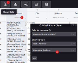
- Select the column you would like to clean, the most common first candidate will be the column containing your addresses (1).
- Click on the data cleaner icon (2) and when the pop-up appears, make sure you have selected the cleaning type e.g. for an address column it would be “Complete Address” (3), then hit Next.
- Before you press Start Cleaning, review which accuracy level you’d like to clean with. You can press change to toggle Manual Review off/on (best when accuracy is vital), turn off automatic cleaning and alter how sensitive the cleaner is.
- When you’re ready, press Start Cleaning.
- After your data is clean, click Save Changes.

Step Four – See Insights (optional)
- Select a column you would like to gain insight on and click on the View Statistics icon.
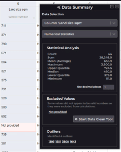
- The Data Summary pop-up will show you important information about the data in your selected column. In the example below, we can see a median of 460sqm in our land size column, and four outliers with irregularly large land sizes.

Step Five – Create the Map
- When you’re ready, select Create Graphic, then Create Point Map.
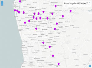
- Vizall should automatically detect the addresses. the map should look something like this:

Here are the most common types of map customisations:
Appearance section
You may wish to change the default map starting location and zoom level when someone opens the interactive map. For example, if you wish to focus on investment in the nothern suburbs, navigate to that area on the map, scroll to the zoom level with the best readability, then press the target button to set it as the new map starting location.
Pick your preferred icons and colours for the map points. You may use multiple icons or colours based on different conditions. Add more conditions using the plus button (1).
Text section
Customise what appears in the Legend (top right corner of the map) and in the Popups (when you hover over a point on the map).
Here is where you can add dynamic content – that is – changing content from the spreadsheet, rather than static text.
For example, in Popups, select Add Column and choose one of your dataset columns. It will appear within curly brackets like this: {Example Column}.
In the example on the left, dynamic content is shown in curly brackets, and the static labels are on the left. The image on the right shows how that will look for the viewer when they hover over a point.

Step Six – Publish & Embed
Once you have finished customising your map, press the dark red toggle under the Publish heading to go live.
You can then use Share Url to share the map with particular clients, or alternatively copy the Share Code, to embed the map in your CMS or website.
After publishing and embedding the map online, you can use the Statistics button to see the total number of views your published map has received.
You hopefully now have a completed point map that you’re happy with. If not, please reach out and let us know where you got stuck. Our team will be happy to step you through any questions or issues.