

Setting up an interactive map with school zones
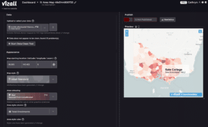
Using the new school zone boundaries in Vizall, you can create interactive Choropleth/area maps for free like the one below:
To start, you’ll need a spreadsheet with a column of an Australian state’s Primary or High schools (Government schools only) and at least one other column with the data you want visualised.
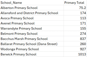
For example, your spreadsheet might contain enrolment numbers or students absences per zoned school. It should look something like this example to the left (although more columns is fine as long as there’s one column containing the list of schools).
If you don’t have any school-based data yet, head to the datasets list below and pick one out that’s relevant.
Now that you have your data, follow these steps:
1. Upload
Head to your Vizall dashboard and upload your spreadsheet in CSV or XLSX (Excel) format. Either drag and drop your spreadsheet in or click “Upload Data”.
2. Check the automatic column picker worked correctly
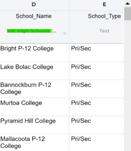
Sometimes the column type estimator gets it wrong. Check if the types are correct by reading the text at the top of the column (see the highlighted text in the example to the right).
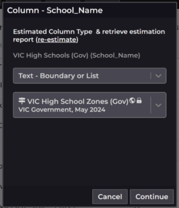
If the column estimator failed:
If the automation failed to choose the correct column type, hit the light grey dropdown arrow near the top of the column and select your school zones manually.
To do this, select “Text – Boundary or List” in the first list of options, then in the second dropdown search within the list of boundary types for the matching location type. You’ll be looking for something like “QLD Primary School Zones” or “NSW High School Zones”.
3. Run the data cleaner over your list of schools
Click on the data cleaner icon ![]() and select the schools column. Click “Next” on the data cleaner pop-up. You’ll get a summary of the problems found in the data.
and select the schools column. Click “Next” on the data cleaner pop-up. You’ll get a summary of the problems found in the data.
Press Start Cleaning.
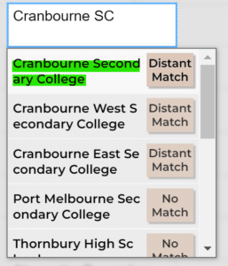 The data cleaner will now fix as many errors or inconsistencies in that column as it can, then ask you to review any ambiguous text.
It will highlight cells it couldn’t match and present you with a dropdown of potential replacements (see right).
Sometimes there may not be a suitable option to match with in the dropdown. That means the school couldn’t be found within Vizall. Most often this is due to inconsistencies in the Government-provided school zone files built into the platform. One reason can be that a school is unzoned.
Once you have reviewed all ambiguous schools in the column press Next or Continue to move on.
4. Get Insights
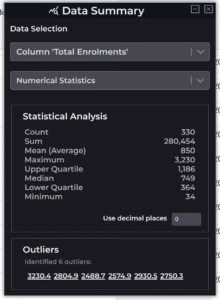
Once the cleaning completes, click on View Statistics ![]() to see some data highlights, such as the maximum, minimum and average values in your columns.
to see some data highlights, such as the maximum, minimum and average values in your columns.
For example, in a column containing student numbers, you’ll see the highest and lowest school enrolments and a total of all Primary School enrolments found across the state (29k in the example below).
You can also use this panel to check for duplicate schools in your school zone list. Just click on your schools column, open the View Statistics panel and check the Top Occurrences section for duplicates.
You must remove duplicate schools in your spreadsheet if your end goal is to create an interactive map. This is because the map can only create the related boundary shape based on a single row. So if there are two rows for “Melbourne High School” the map creator will take the first row and ignore the second.
5. Create your interactive map
Hooray! This is the part where we see our data come together to create a colourful choropleth/area map.
Select Create Graphic ![]() and choose Create Area Map.
and choose Create Area Map.
You’ll hopefully see data already loaded onto a map like in the example below.
Vizall works some magic to match up locations with geographic areas, but sometimes it gets that wrong.
If you’re not seeing data on your map, click change in the top Data section. This is where you can tell Vizall which one of your spreadsheet’s column contains a location, like suburbs, to line up with a matching map boundary.
For example, if you have a column called Victoria Schools, select it from the Select Location Column dropdown, then under Select map boundaries find “VIC Schools” from Vizall’s list of recognised locations.
Also check which column is being used to display data on the map under Area style column in the Appearance section. This should be the column you want visualised, for example “Total Enrolments”.
For full instructions on how to customise your interactive map, head to this guide on our blog.
Once you’re happy, spot check the data to make sure the numbers line up. Check against the original data, and be sure your original data source is reliable and accurate.

Press the red button in the Publish section to go live. After it turns green you get access to the Share URL button and Share Code to embed interactive maps on websites or blogs.
School datasets list
A couple of limitations before we wrap up
- Unfortunately WA, Tasmanian and NT school zones are not currently compatible due to a lack of public online data sources.
- Although we used official Government school boundary files, you may find not all schools show up on the map. This is usually due to how the school was zoned. For example, in South Australia some Government schools are zoned while many are not. As a result they can’t easily be visualised on this type of interactive map (stay tuned for Point Maps in the near future though!).
If you aren’t sure about any of the steps above please reach out to us at the community or via email where we’d love to help you.
In the meantime, Happy Vizalling!
Read more: